 EN
EN FR
FR DE
DE ES
ES PT
PTIf your form doesn’t look good on mobile screens, here are some good practices to fix it:
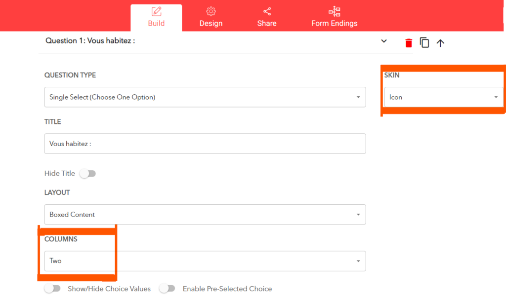
1. Use visual image/icon buttons with 2 columns only: If you are using select buttons with an image or icon as the skin type, make sure to use a maximum of 2 columns. Otherwise, mobile screens don’t provide enough room for several columns to show up properly.
Alternatively, switch back to select or radio buttons which are mobile responsive.
3. Create a dedicated form for mobile: If you still find it hard to make the form look good on mobile, consider duplicating your form and creating a slightly adjusted form, designed for mobile screens.
Use smaller text values, decrease form internal spacing, and make other changes to achieve a good look.
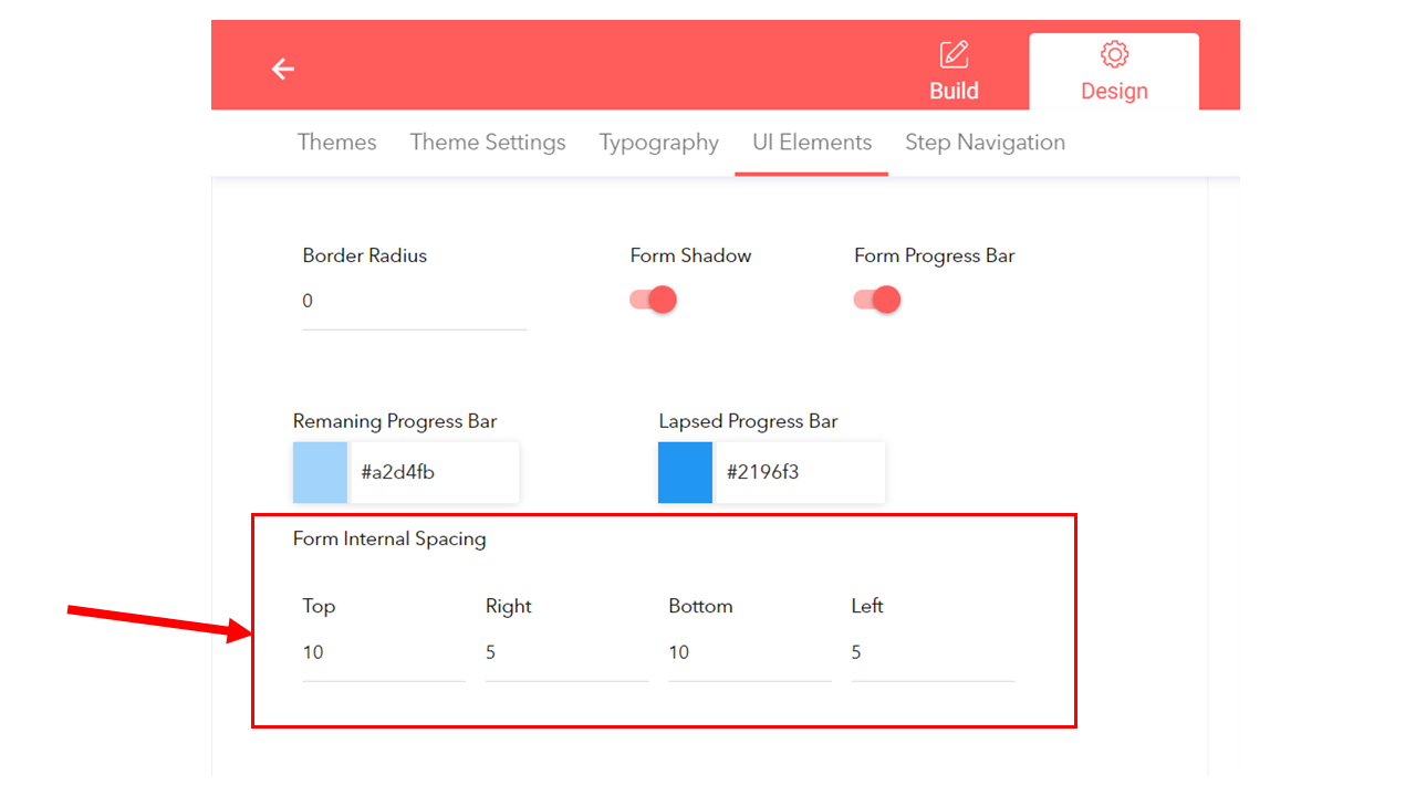
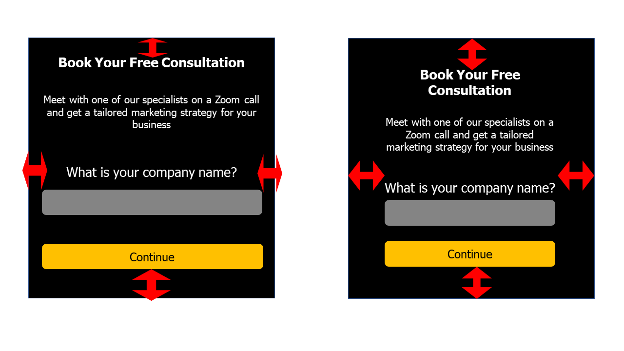
Different form internal spacing settings and the effect on the form design. Small form internal spacing on the left, higher form internal spacing on the right
You can simply paste the 2 different embed codes into your page builder, hide the mobile code on the web, and vice versa.
These steps should help avoid most issues with mobile responsiveness.